 Absolute Addons
You can showcase your achievements with confidence by using our 9 variation style layout of the Fun Fact widget.
You can see the below video to understand how you can use the Fun Fact Widget. Or you can follow the documentation whichever you find convenient.
Step 1
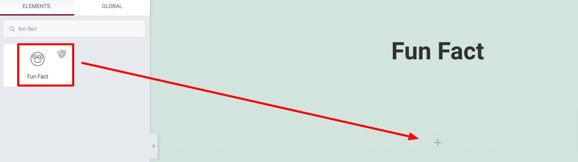
To use our Fun Fact widget, at first create a section by clicking on the “+” icon and then choose the column. For Fun Fact widget you can choose the 3 columns. Now from the left bar search for Fun Fact. Drag the block and drop it into your created section.
Now under the Control tab, from the Template Style dropdown menu, you can choose the style. There are ten different styles available.
You can see all the styles from here. Chose the style you want by clicking the style number.
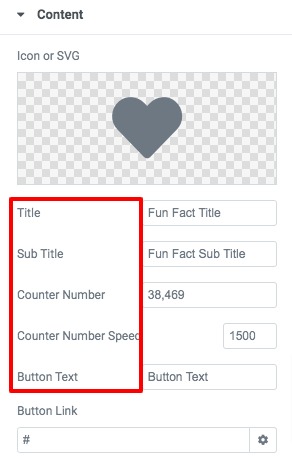
After selecting the style go to the content menu and add a contet for your Fun Fact section. First, add an icon from the icon library or add your own SVG icon. Add title, subtitle, counter number, counter speed and button from this menu too.
Step 2
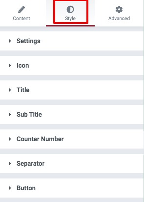
Move on to the style tab to add style in the section. You will find different style options here.
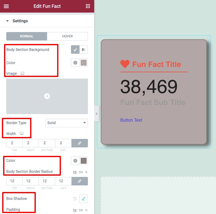
Setting
Add the body section background color, birder type, border width, radius color from here. You can also add box-shadow, padding and margin for both normal and hover conditions.
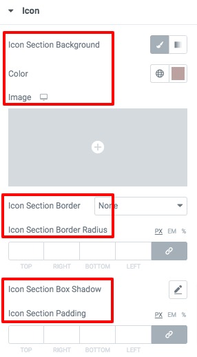
Icon
Set the icon background color, icon color & size, border type, box-shadow, padding and margin for the icon.
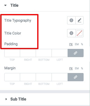
Tite, Subtitle & Counter number
Set the title, subtitle and counter number typography, color, padding and margin from the title, subtitle and counter number menu.
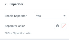
Separator
You can enable or disable the separator from here and add separator color.
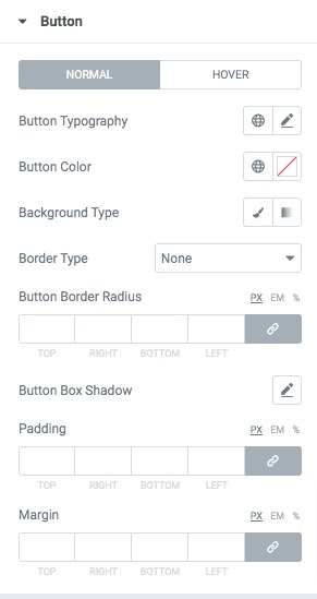
Button
Style up your button section from this menu for both normal and hover conditions.
Great! you have successfully redesign your Fun Fact section.