 Absolute Addons
Add a stunning team section with the carousel feature using the Team Carousel widget.
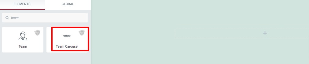
Step 1
To use the Team Carousel widget, first you need to create a section by clicking on the “+” icon on Elementor and then from the block section of the left bar search for Team Carousel. Drag the Team Carousel block and drop it into your created section.
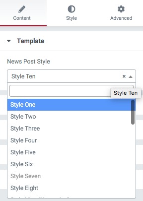
Under the Content tab from the template menu, you can choose the team carousel presets. There are eleven presets available. You can see the demo from here.
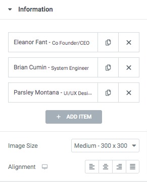
After selecting your presets go to the Information tab to add team members. By default, there are three items available. You can copy an item by clicking on the copy icon and deleting an item using the delete icon. To add a new item click on the Add Item button. After that, you can set the team member image size and alignment.
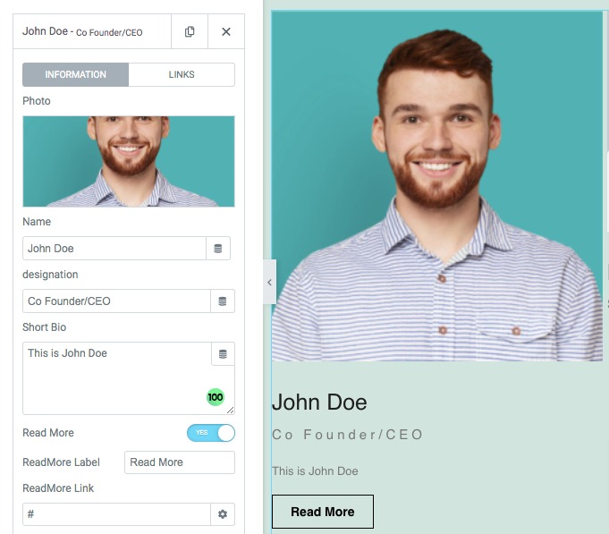
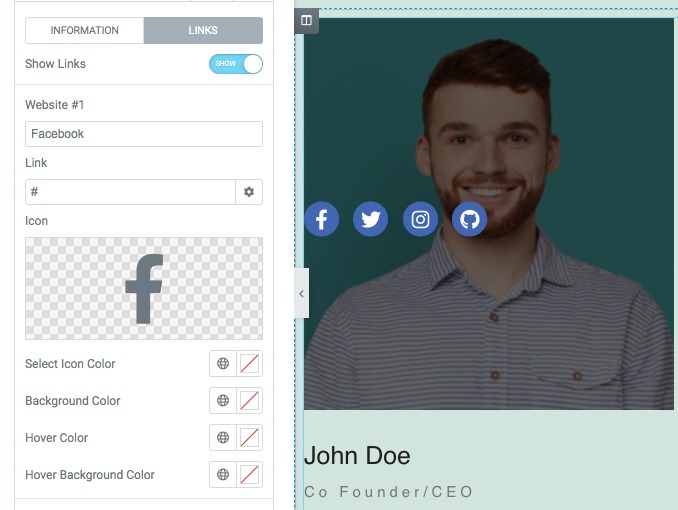
Click any of the items to edit the information on it. From the information, you can add a team member image, name, designation and a short bio. You can also show or hide a read more button for any specific team member.
From the links tab, you can add social media icon. links and set the icon color, background color, hover color, and hover background color for social media icons.
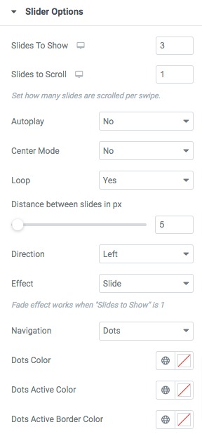
Slider Options
From the Slider Option menu, you can set up your slider features. You can choose the number to display in the slider as well as scroll in the slider. You can enable or disable the autoplay & loop option and set the autoplay speed. You can also set the distance between siders and slider direction as left or right. There is also an option to choose slide effect as slider or fade.
You can choose the navigation as –
- Arrows & Dots
- Arrows
- Dots
- None
Set the arrow color, arrow hover color, dot color, dot border-color, dot size and others.
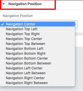
Navigation & Dots position
From the navigation position and dots position option you can select the position for the navigation arrow and the dots. There are different positions available.
Step 2
Now move on to the style tab where you will find different style options to edit your section.
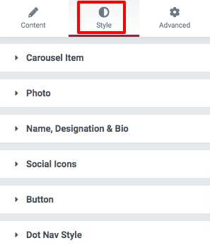
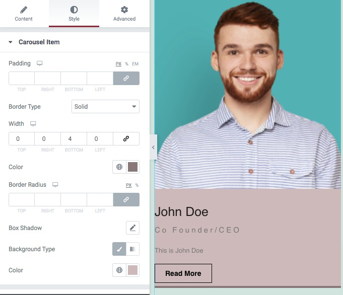
Carousel Item
Add background color as classic or gradient. Set box-shadow, border type, border radius, padding, and margin for the carousel item.
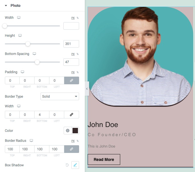
Photo
Set team member image width, height, bottom spacing, border, border-radius and box-shadow.
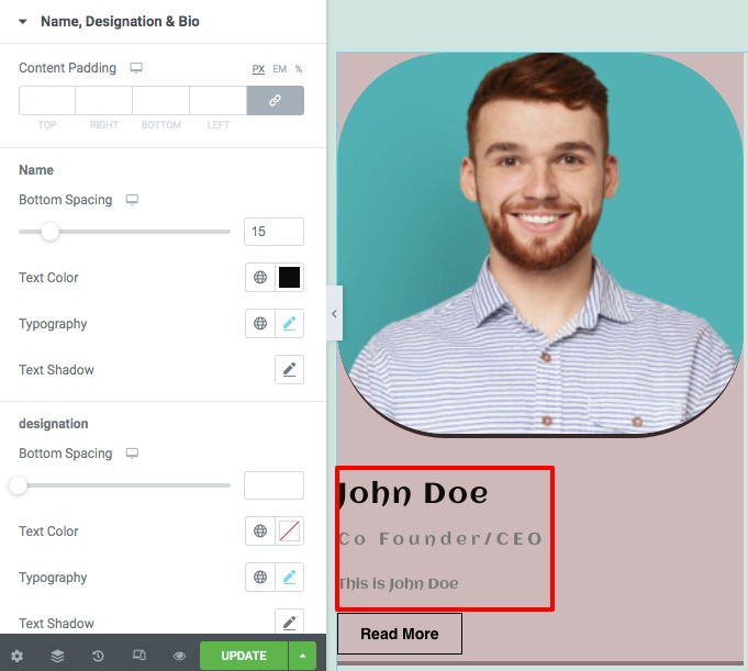
Name, Designation & Bio
From here you can set bottom spacing, text color, typography, and text-shadow for team member name, designation, and bio content.
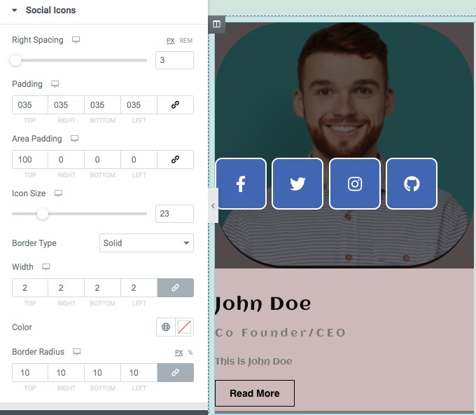
Social Icons
Set social icon spacing, padding, icon size, border type, color, border-radius from this section.
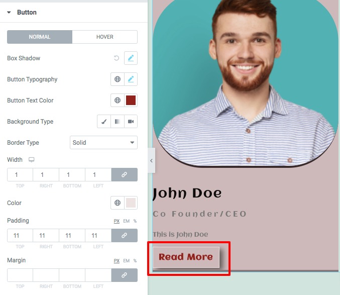
Button
From the button option, you can set button typography, color, background, box-shadow, border type, padding, and margin for both normal and hover conditions.
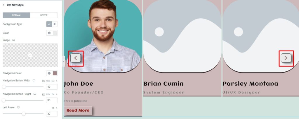
Dot Nav Style
Set navigator arrow background color, navigator color, width, and height. You can also add arrow spacing and box-shadow. After that add box-shadow, border type, border color, padding, and margin for normal condition. And for hover conditions, you can set the background color, navigation hovers color, and hover border color.
That’s it! Your team carousel section is ready to use.