 Absolute Addons
Showcase your Counter section with an eye-catchy design using the Counter Box widgets of the AbsolutePlugins. It will enable you to add many features and styles to your Counter section.
You can see the below video to understand how you can use the Counter Widget. Or you can follow the documentation whichever you find convenient.
Step 1
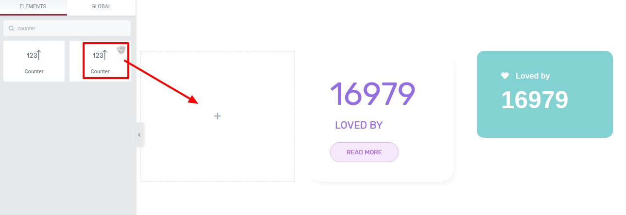
To use our Counter widget first, create a section by clicking on the “+” icon on Elementor. For the section, you can choose the column section to display the icon in a better way. After that from the block section of the left bar search for Counter. Drag the block and drop it into your created section.
Now under the Content tab, you will find the content section where you can add a different styles of counter boxes. There are nine different styles available for the counter box section.
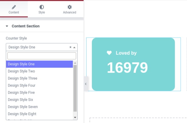
You can see all the Counter Box styles from here.
After selecting the style you can change the title from the counter title field. Add a number to count and speed from the counter number and speed field. Use the select icon option to enable or disable the icon and add your icon from the icon option.
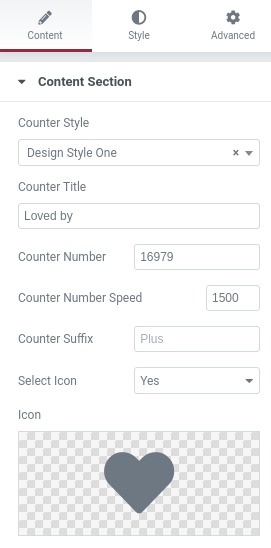
You can add icons from the icon library or you can upload your own in SVG format.
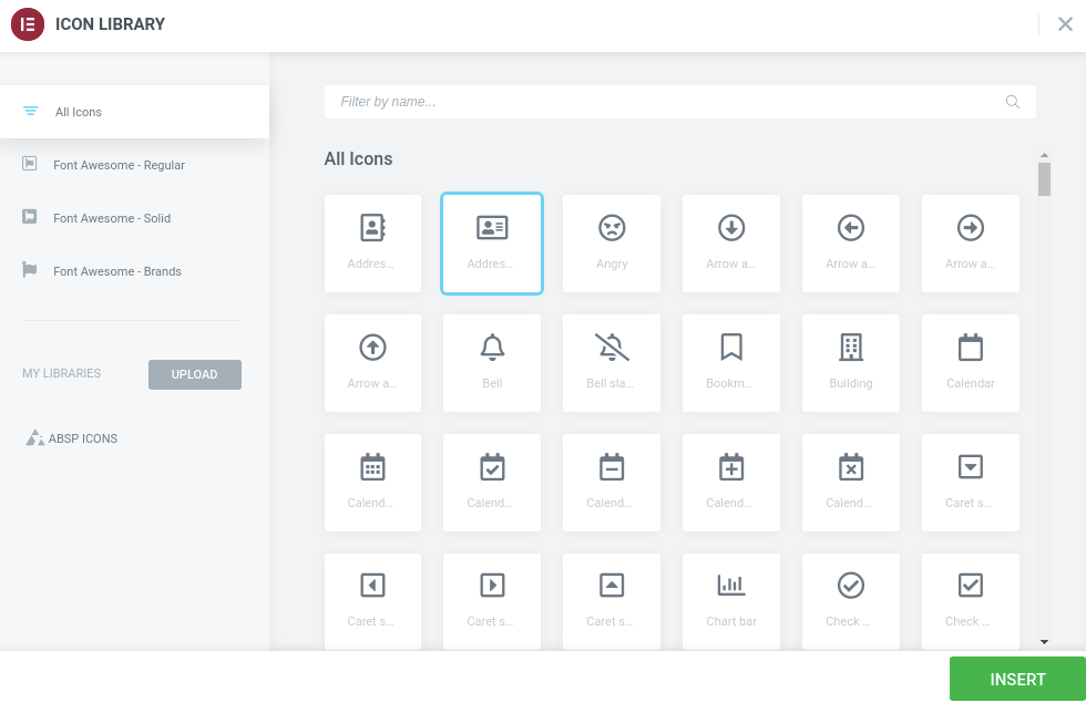
To add an icon from the icon library click on the Icon library option and it will pop up the Elementor default icon library page. Just select the icon you want to add and then click on the Insert button.
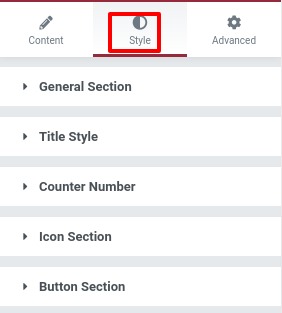
 Move on to the style tab and here you will find all the options to edit your counter style.
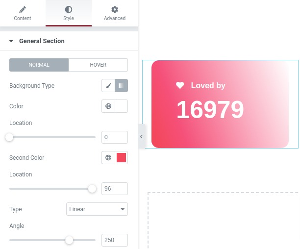
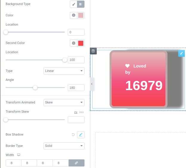
From the General Section menu, you can set the style for normal condition and for hover condition. Set the background type as classic or gradient from the body section background field. You can add a background image from the classic option and add color gradient from the gradient option.
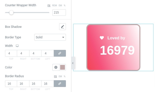
Set the counter box width using Counter Wrapper width. You can add a border to the section from the border type option. There are different border types available you can choose any one of them. Add your border width the width field. Choose a color for the border from the color field and add your radius from the radius field.
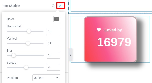
Click on the edit icon of the box-shadow field and the box-shadow option will open up. You can choose the shadow color from the color option. Set the box-shadow as horizontal or vertical, you can blur the shadow and set the position as inline or outline.
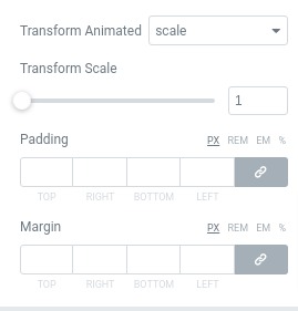
There are three counter animation styles available –
- Rotate
- Skew
- Scale
Choose the animation from the transform animated dropdown menu and add the transform scale. Add padding and margin if necessary from the padding and margin option.
For hover condition, you can select hover background, animated transform, transform scale, border type, border-radius, box-shadow following the same way.
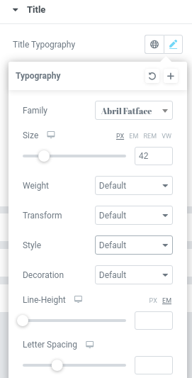
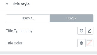
 Now come to the title option to style your title text. For the normal conditions in title typography, you have two options, you can add custom typography or you can set your title from the style options.
Click on the edit option and the style page pop up where you can set the font family, font size, width, line height, and text transform.
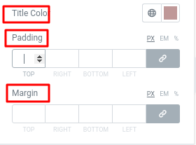
Set the color from the title color option and add margin and padding to set the position.
For hover condition, you can set the title typography and color too.
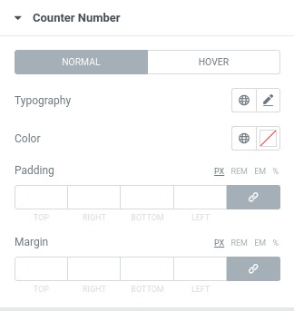
Design your counter number from the counter number option following the same way you style the title section. All the options are the same.
For the icon section, you can add the icon background, set icon typography, height and width for normal and hover conditions.
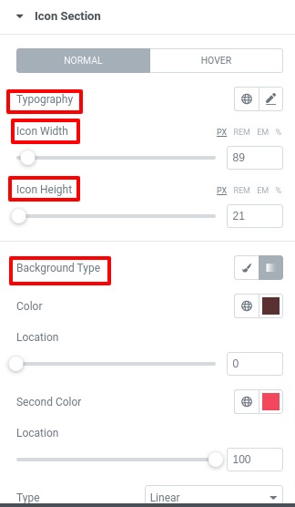
You can also add individual box-shadow, border type, border-radius, padding and margin for the icon section. You can also change the color of the icon from the color option both for the hover and normal conditions.
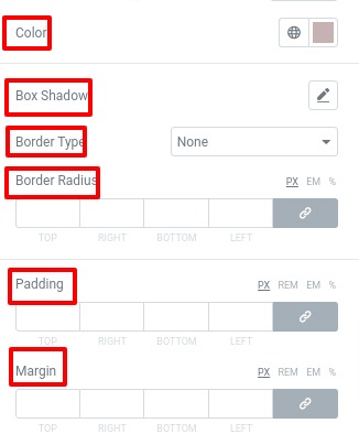
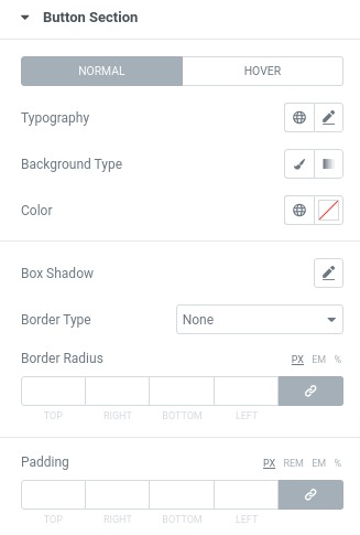
From the button section, you can style the same way you did in the icon section for both normal and hover conditions.
Great! you have successfully redesign your Counter Box.