 Absolute Addons
The Testimonial Carousel widget enables you to decorate your testimonial section in a unique way. You can easily implement it in your web pages and edit it within a minute based on your requirements
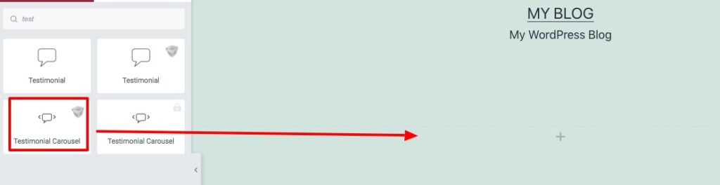
Step 1
To use our Testimonial Carousel widget, first, create a section by clicking on the “+” icon on Elementor and then from the block section of the left bar search for Testimonial Carousel. Drag the Advance Accordion block and drop it into your created section.
Now under the Content tab, you can select the Testimonial Carousel style from the Testimonial Carousel Style dropdown menu. There are twelve unique and professional-looking styles available for the Testimonial Carousel section. You can choose any of the styles you want.
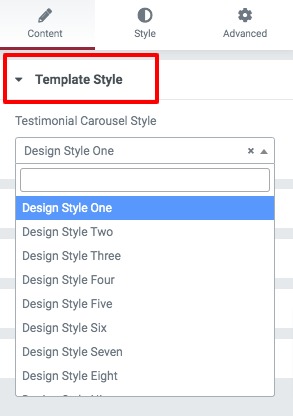
You can see all the Testimonial Carousel style presets from here.
Step 2
After selecting your style now it’s time to add content to it. From the content section, you can see the default items. You can copy an item, delete it or add a new item from here.
Click any of the items to add your data. First, you need to add the title and then add the designation. Now you can add the image and review numbers. After that, you can select the review icon too. Add your description content at the end.

Now from the Slider Option menu, you can set up your slider features. You can choose the number to display in the slider as well as scroll in the slider. You can enable or disable the autoplay & loop option and set the autoplay speed. You can also set the distance between siders and slider direction as left or right. There is also an option to choose slide effect as slider or fade.
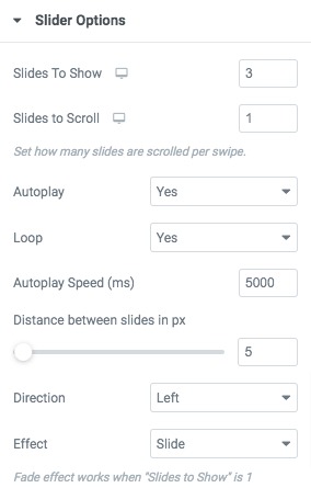
You can choose the navigation as –
- Arrows & Dots
- Arrows
- Dots
- None
Set the arrow color, arrow hover color, dot color, dot border-color, dot size and others.
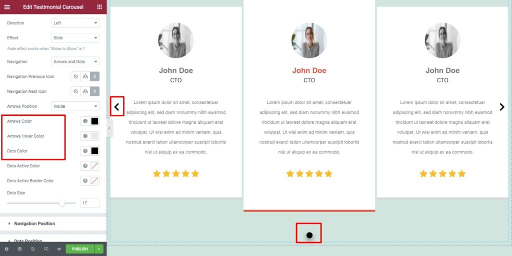
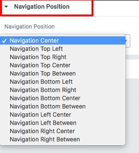
Navigation & Dots position
From the navigation position and dots position option you can select the position for the navigation arrow and the dots. There are different positions available.
Step 2
Now move on to the style tab where you will find different style options to edit your section.
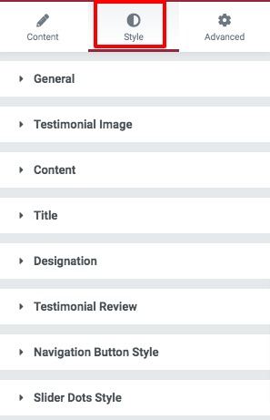
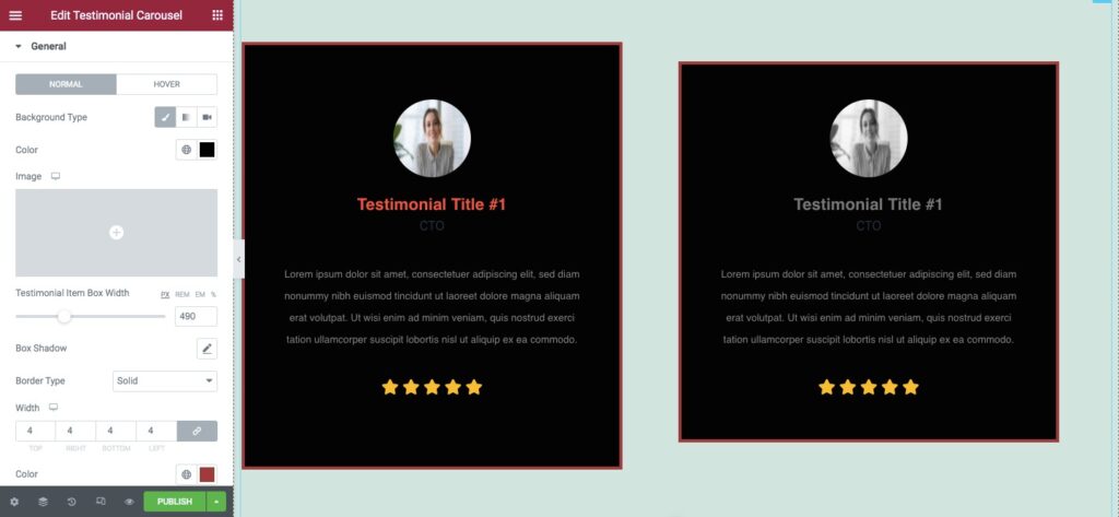
General
From the general section add background color as classic or gradient. Set item box width, box-shadow, border type, border radius, padding, and margin for both normal and hover conditions.
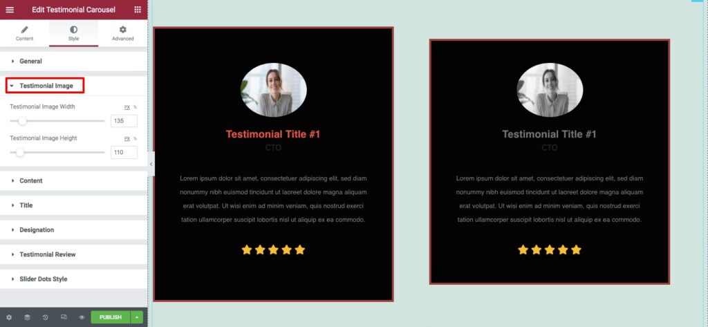
Testimonial Image
Set your testimonial image height and width from here.
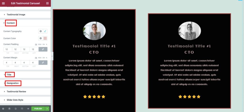
Content, Titel & designation
Add content, title and designation font family, size, line height, color, padding and margin for your description content.
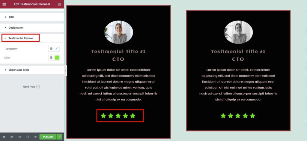
Testimonial Review
From here you can change the testimonial review icon color, size, letter spacing and others.
That’s it! you have successfully redesigned your testimonial section.