 Absolute Addons
Absolute Addons Dual Button widget helps you to display two buttons horizontally or vertically in different styles.
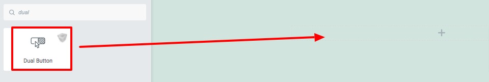
Step 1
To use the Dual Button widget, first you need to create a section by clicking on the “+” icon on Elementor and then from the block section of the left bar search for Dual Button. Drag the Dual Button block and drop it into your created section.
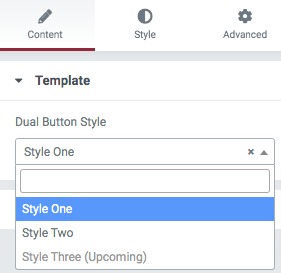
Under the Content tab from the template menu, you can choose the Dual Button presets. There are two presets available. You can see the demo from here.
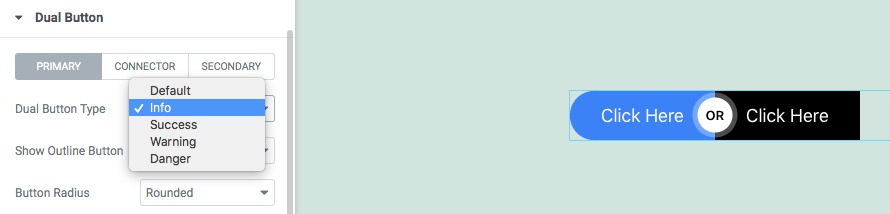
After selecting your presets go to the dual button option to set up the buttons. Here you can set up your primary button, secondary button, and connector.
First, you can set primary and secondary button types. The button types are –
- Default
- Info
- Success
- Warning
- Danger
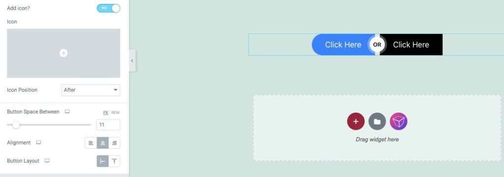
You can show or hide the button outline and set the button radius as –
- None
- Round
- Rounded
- Full
After that set the button HTML tag, button text, link, and button size. You can also add an icon on your button and set the icon position. Set button alignment and button layout as horizontal or vertical.
Step 2
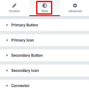
Move on to the Style tab where you will find different style options to style up the section.
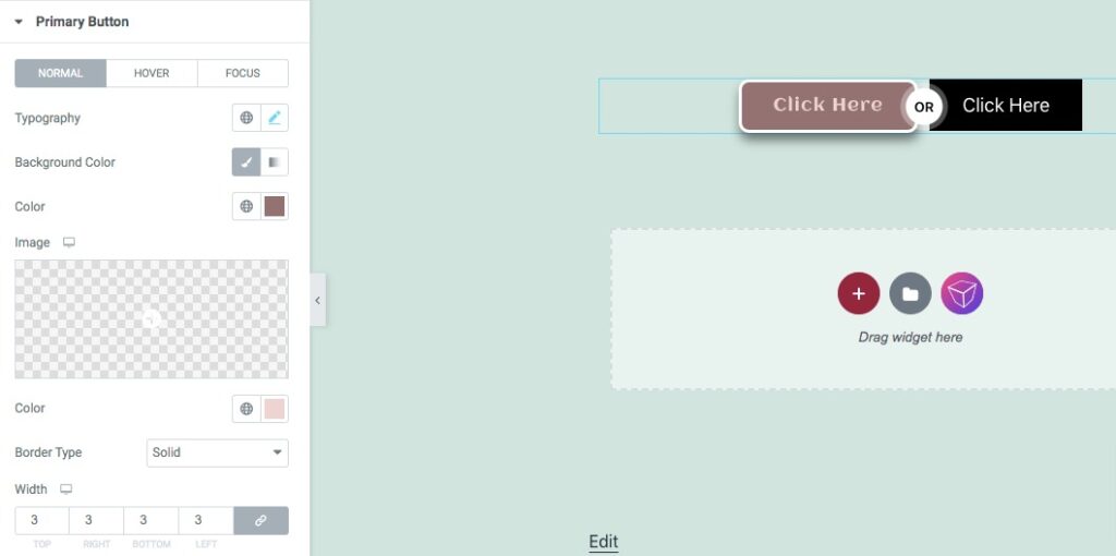
Primary Button
Set primary button typography, background color, border type, border radius, box-shadow, padding, and margin for normal condition.
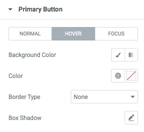
For hover and focus conditions, you can set the background color, text color, border type and box-shadow.
Similarly, you can apply all these styles on your secondary button too.
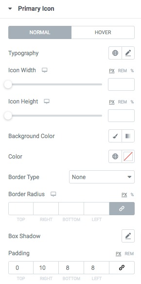
Icon
You can set the primary and secondary icon typography, width, height, background color, border type, border radius and others.
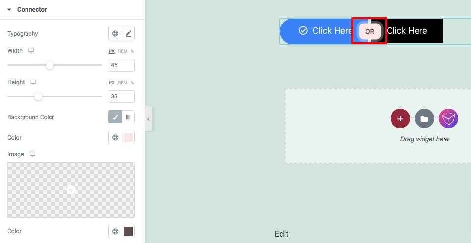
Connector
Set connector typography, height, width, background color, text color, and others from here.
That’s it! Your section is ready to use.