 Absolute Addons
Our call to action widget enables you to add professional looking Call to Action section to your website. You can add the widget anywhere on your website.
You can see the below video to understand how you can use the Call To Action Widget. Or you can follow the documentation whichever you find convenient.
Step 1
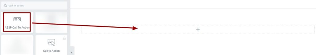
To use the widget, at first create a section by clicking on the “+” icon on Elementor and then from the block section of the left bar search for Call to Action. Drag the Call to Action block and drop it into your created section.
Now under the Control tab, you can select the Call to Action from the Call to Action Style dropdown menu. There is eleven unique and professional-looking style available for the Call to Action. You can choose any of the styles you want.
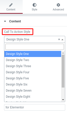
You can see all the Call to Action style from here. Choose any of the styles you want by clicking on the style number.
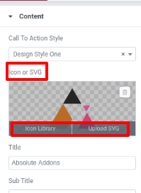
Select the style one from our Call to Action style. Now you can change the icon from the Icon or SVG option. You can set icons from Elementor’s default icon library or you can upload your own icon in SVG format.
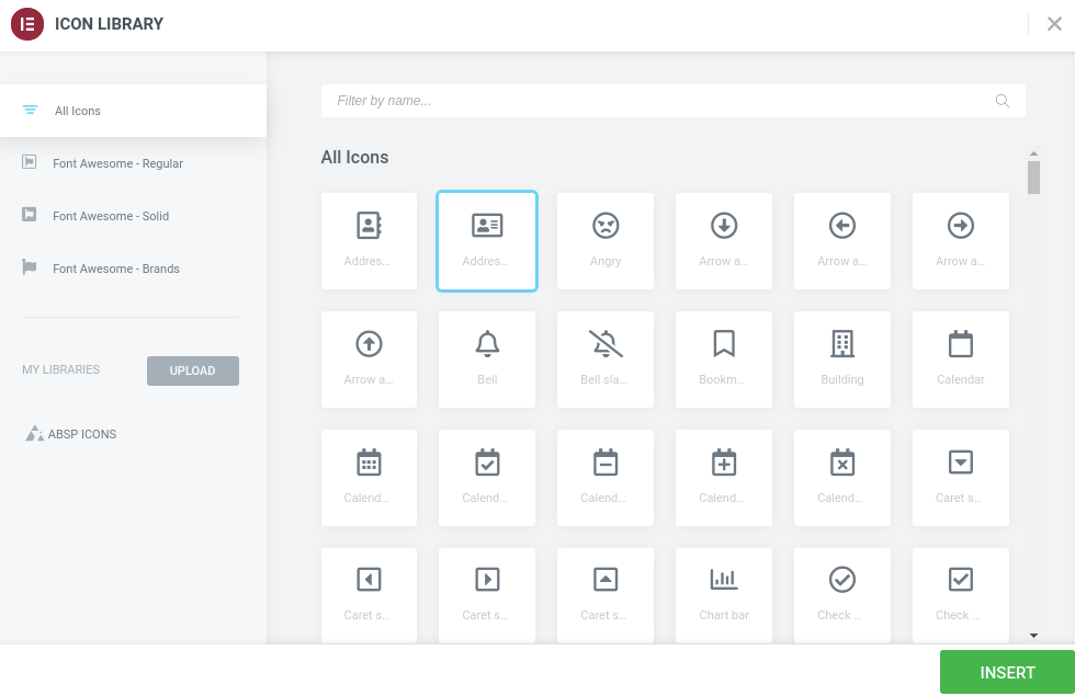
To add an icon from the icon library click on the Icon Library option, it will pop up the Elementor icon library. From there you can set your icon. Choose the icon and click on the select button and your icon will be added.
To upload your own icon click on the upload SVG option and browse your icon or drop-in media library.
You can change the title from the title option. In the title, field add your call to action title and in the subtitle field, you can add your subtitle. In the text section, you can add your text.
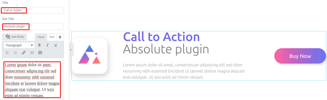
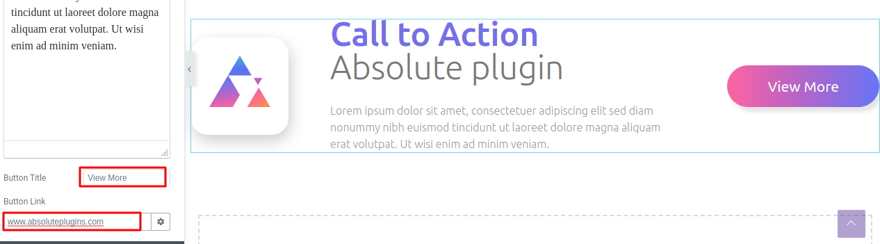
To edit your button text go to the button title field and add your text to show in button. From the button, link field add your link to redirect when someone clicks the button.
Step 2
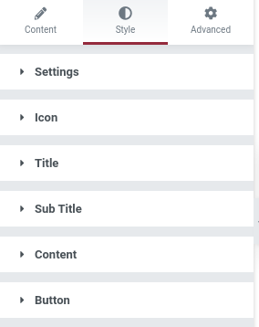
Move on to the Style tab to redesign your call to action section. In the style tab, you have six menus to style the section.
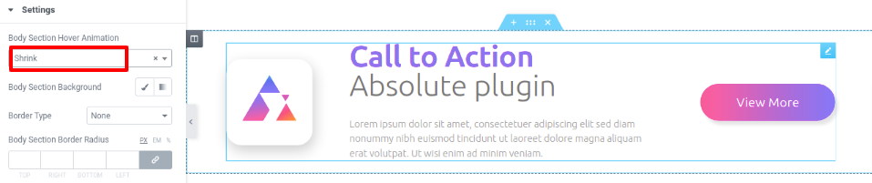
In the settings menu, you can add a hover effect to your call to action section. There are many hover effects available under Body Section Hover Animation options. You can select any of the animation effects you want. We set the hover animation as “shrink”. So our section is shrinking when we place the course on it.
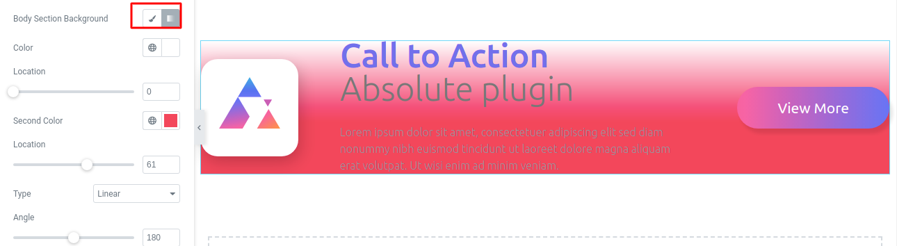
Set the background type as classic or gradient from the body section background field. You can add a background image from the classic option and add a color gradient from the gradient option.
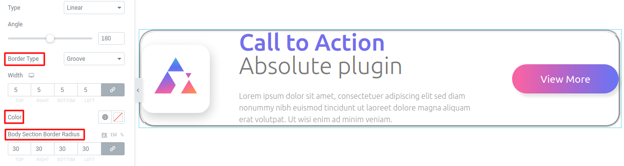
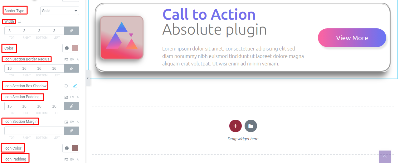
You can add a border to the section from the border type option. There are different border types available you can choose any one of them. Add your border width from the width field. Choose a color for the border from the color field and add your radius from the radius field.
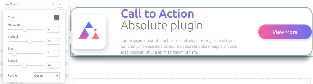
Click on the edit icon of the box-shadow field and the box-shadow option will open up. You can choose the shadow color from the color option. Set the box-shadow as horizontal or vertical, you can blur the shadow and set the position as inline or outline.
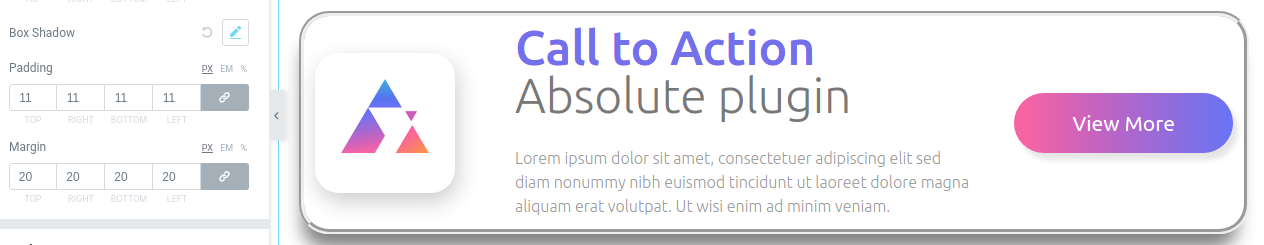
You can add padding and margin if needed to place the Call to action section at the right position.
Click on the icon menu and icon style options will open up. Set your icon background from the icon section background field.
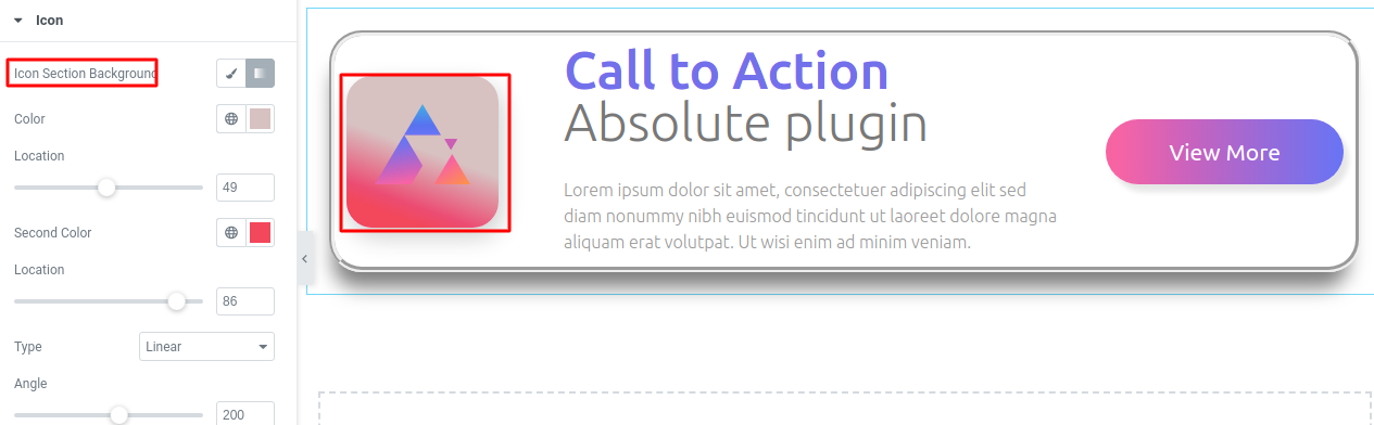
Add border type, box-shadow, icon section padding and margin, icon color in the same way you edit the call to action section.
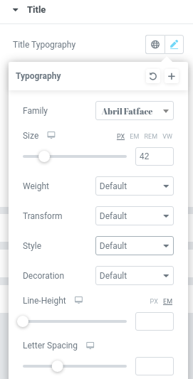
Now come to the title option to style your title text. In title typography you have two options, you can add custom typography or you can set your title from the style options.
Click on the edit option and the style page pop up where you can set the font family, font size, width, line height, and text transform.
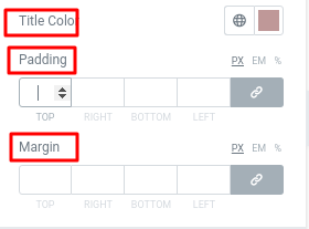
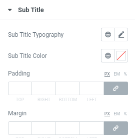
Set the color from the title color option and add margin and padding to set the position.
Style your subtitle and content following the same way you style the title. All the options are as we describe in the title section.
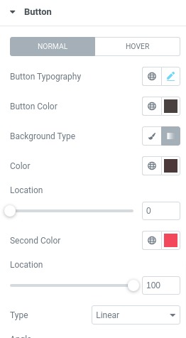
Here you can style the button of your call to action section. In the button menu, you can add style in two conditions normal and hover. You can style button typography the same way you did to the title or subtitle text. Then you can set button color, button background type, button border, border-radius, box-shadow , padding margin. All the procedure are same you did it earlier.
Well done! you have successfully redesign your Call to Action section.